Sunday, September 21, 2014

Week 4A

Continued working on icon for "application" for the website Mixmax:

We began class first by doing a class-critique of our works.
Some of the points that were brought up for my designs:

  • Colors were nice, could use some gradient (for the M design).
  • Strong use of metaphor.
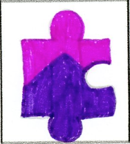
  • Don't understand the mountainous feel (from the puzzle piece design).
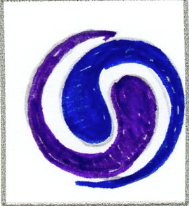
  • Try combining the first two ideas, use the arrow on the M to connect to the envelop.
  • Puzzle piece conveys the sense of "piecing" or "building". Hard to tell what application is used for though, try adding a wire frame design to the puzzle piece.
  • Possibly angle the M a little.
  • Use of 3D is done nicely.
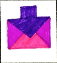
  • Didn't notice arrow in envelope.
--

From the feedback that I received, I realized that the puzzle piece was the most favorite. Although no one understood the use of the mountain in the design. This design idea was probably a stretch, I used the idea from their website's background image. So it doesn't really tie into the function as well as the theme.

I really enjoyed the feedback for adding the wire frame to the puzzle piece. So I started reworking the puzzle piece during class, adjusting angles and colors before adding a wire frame look.

I also reworked the shape of the puzzle to look more realistic instead of blocky.

Sunday, September 14, 2014

Week 3 Outside of Class

Continued working three icon designs for the site "application" Mixmax. 
For my designs, I chose the pick these three out of the four that were voted for by my group-critique-mates.
  • The "M" icons with the arrows symbolizes their brand name with the letter "M" and also has two arrows to show "mixing".
  • The envelope is supposed to relate to email, and there is a arrow within the envelope which is for a "upgraded email", which is Mixmax's main feature.
  • The puzzle piece symbolizes building, as in building a new email. There is also a mountain within the puzzle piece, which is just supposed to tie into the theme Mixmax has on their website.
All of these designs also feature a purple-hued color palette, which goes along with their color scheme for their website.


Wednesday, September 10, 2014

Week 3B

Began class talking about reading for homework.
Continued working on Icon designs with a mini in-class critique.
My group picked out their favorites which demonstrated: metaphor, narrative, shape, and design.
These were the favorites that were picked out:


Homework for Next Class:

  • 3 Final Detail Color Drawings of Icons
  • Start Design of Final Report
    • Cover Page
    • Overview
    • Project Brief
    • Visual Research (Initial Sketches)


Monday, September 8, 2014

Week 3A

Began class going over assigned readings for homework.
Continued by taking some notes on "Metaphor and Icon Creation", these notes are key to our icon exploration for our next project.
What makes a good icon?
  • Iconic: Simple, bold, elegant.
  • Narrative: Tells a story to the viewer using simple design.
  • Abstract: Complex ideas using abstract designs to explain a process.
-Icon Creative Process:
  • The Brief:
    • Context?
    • What is it for?
    • Who is it for?
    • Is there a single message?
    • Does it need to be an icon?
  • Visual Mind Map
  • Sketching in Context - Size
  • Sketching in Context - Placement
  • Sizing
    • Application Icons - 128px - Dock, Finder Previews.
    -
    Homework for Next Class:
    • Readings: Interface Design: Pages 90 - 95
      • Icons: Icons are a interface tool that visually focus attention and communicate, in a concise way, a call to action through an understandable visual metaphor. The Icon needs to clearly convey its function to the user. The image can be specifically connected to the function or be represented or abstract. There is an established iconic vocabulary that users are familiar with, example: house = homepage, envelope = email. 
      • Metaphor and Context: Metaphor is the transfer of meaning from one object to another. A suitable UI metaphor is one that explains the function and facilitates action instantaneously. Must be readily understandable. Adding text labels to icons helps optimize usability, as some iconic meaning will take time to learn.
      • Designing Icon Families: Due to the utility of an icon, it needs to be able to function at different sizes. The icon will also need to work at different resolutions of color display.
    • The Brief: Questions for Icon Process:
      • Context?

      • What is it for?
        • Mixmax is a program that is used through Google Gmail. Mixmax upgrades your gmail account so that when you send emails to others, you can create a visually appealing email with different design elements. It's a drag and drop function so you can place specific elements in the email, such as content headers and placement boxes.
      • Who is it for?
        • Mixmax is for designers who wish to upgrade the look and professional feel of their email. When they send emails to other designers, clients, or employers, they can create a unique design experience that is visually appealing to the intended reader. Instead of just using plain text and the normal functions in an email, they are open to a broad new approach to designing emails.
      • Is there a single message?
        • Is the fastest way to create engaging and interactive HTML email directly from your Gmail window.
      • Does it need to be an icon?
        • Specifically, this program does not need to have an application icon as it is going to be a in-browser application, something that is going to be used directly in Gmail. But for this class, we will create a hypothetical application start-up icon for if this website had an application on a desktop.
    • Visual Mind Map: Mind mapping exercise with illustrations:

    • Sketching in Context - Size: Sketching with scale in mind: 30 Sketches:

    Week 2 Outside of Class

    Homework for next class:
    -Bring drawing materials and tablet.
    -Explore Website for Icon Design: Write 200 words on blog for what the website is about, how it works, how icons could enhance the usage.

    • The first thing you notice when going to Mixmax.com, is that there is an entry bar to type in your email to gain early access to the newly developing website. The website as a whole has a very subtle design, minimalist and clean. The typefaces used are a simple sans-serif colored white against a purple-hue background overlooking some sort of desert. Towards the bottom of the page you see there are three, evenly spaced round images of the head developers of the website. Under each image is a name, position, and short description of what that person does, followed by a link to their own twitter accounts. As for the rest of the website, it is unknown unless you receive an email invite for access to the site (which I have not yet).
    • I think icons would help this page in a way to guide the users through the content. I can see the use of very minimalist icon designs to tie into the already simple and clean theme. Possibly a very symmetrical design, no outlines, little use of color. 

    -Readings:
    • "Icons and Interface" pages 124 - 145
    • "Type on Screen" pages 148 - 149
      • Working with Color: Traditionally, logos were produced using just black and white. Color used to be a luxury. While today, color is dominant. While color plays an important role, designers must always consider the logo within the context of the company's page. For example,  a TV station or online business will have little use for a black and white logo.
      • Digital Color Systems: Hexadecimal: Colors in HTML, represents the percentages of red, green, and blue, that make up a color on screen with six digits. A Hex color tag always starts with a (#) sign in HTML and CSS. RGB: All colors on screen are rendered in mixtures of red, green, and blue light. RGB is an additive system, these three colors combine in ratios to create a broad range of colors. RGBA: Same color system as RGB. with addition to Alpha. Alpha values measure on a scale of 0 to 1, which determine the transparency of a color. 0 would be transparent, while 100 would be opaque. PNG images use the Alpha channel.
      • Color Harmonies: 
        • Complement - Two colors opposite of each other.
        • Split Complement - One base color plus two colors that sit on either side of the complement.
        • Analogous - Two or more colors that sit next to each other.
        • Triadic - Three colors spaced evenly around the color wheel.
        • Square - Four colors spaced evenly around the color wheel.
        • Tetradic - Four colors in two complementary pairs.
    -Icon Capture: Post image of icon with a two line description of function. 15 Physical World, 15 Digital World.
    1. Water - Found on a refrigerator, option to choose water.
    2. Ice, Cubed - Found on a refrigerator, option to choose cubed ice.
    3. Fan Speed - Found on a air purifier, option to change fan speed.
    4. Don't Touch - Found on a bread slicing stand, don't put hands near blades.
    5. Danger - Found on a ladder, careful when climbing.
    6. Danger - Found on an oven, don't stick head in oven while shelves are rotating.
    7. Manual - Found on a reclining chair, read manual for instructions.
    8. Call Hold - Found on a phone, option to place call on hold.

    1. Find - Option to type in a field specific names or keywords to search for a file. Found in Winrar.
    2. View - Option to view specific files that are downloaded. Found in Winrar.
    3. Devices - Option to select different devices such as printers, scanners, etc. Also adjusts sound options in devices such as headsets, etc. Found in Windows Control Panel.
    4. Apps - Option to select and view different types of applications. Found in Google.
    5. Notifications - Option to view notifications, icon will usually change and show a number when a notification comes in. Found in Google.
    6. Go Mobile - Icon that will take to you a page with different option to go mobile. Found on USAA.com
    7. Settings - Option to select different settings for the account/page. Found in MSN Email.
    8. Chat - Option to bring up friends list to begin a chat. Found in MSN Email.
    9. Full View - Option to stretch page to full screen size, or shrink down. Found in MSN Email.
    10. Chat - Option to bring up friends list to begin a chat. Found in Facebook.
    11. Privacy Settings - Option that brings up privacy settings for the account. Found in Facebook.
    12. Favorites - Option to favorite a specific web page or view other Favorited pages. Found in Google Chrome.


    Week 2B

    Watched a video in class about Icon Designer Susan Kare:

    Susan talked about her career and experience in designing icons for different functions. Most of her work was with early Apple computers and Windows computers. She is the designer of common icons such as the: mouse pointer, happy mac, paint bucket, eraser tool, various application icons, etc.

    Some of her presentation she talked about the process behind creating the icons, such as the limitations and expectations of the users. One of her limitations was making the icons a certain size, such as 16x16, etc. Susan explained though that this was her favorite form of icon work. She enjoyed the constricted space and simple designs that went into the icons. Much of her work still lives today in applications, although they were redesigned to have more detail to keep up with todays technology.

    It was a very interesting video to watch and I enjoyed learning who the designer was behind such common icons, and I really enjoyed her processes behind the designing.

    -
    Began talking about our next project we will be working on:

    We will be doing research on a website we choose, from a list given, and will be planning and designing an icon set that represents the application/website's user interface.
    -Application Icon Design: Company:

    • MixMax

    -Icons

    • Main Application Icon
    • Pictograms
    • Ideograms

    -
    Homework for next class:
    -Bring drawing materials and tab.
    -Icon Capture: Post image of icon with a two line description of function. 15 Physical World, 15 Digital World.
    -Explore Website for Icon Design: Write 200 words on blog for what the website is about, how it works, how icons could enhance the usage.
    -Readings:
    • "Icons and Interface" pages 124 - 145
    • "Type on Screen" pages 148 - 149